Is it too late to become a LEGO master? I hope not! (25 Photos) by: Stephen Apr 17, 2024 04/17/24 1874 Liked! 4 Disliked 0 lifestyle
It’s official: popcorn buckets can no longer be normal (29 Photos) by: Camry Apr 16, 2024 04/16/24 1457 Liked! 8 Disliked 0 entertainment
Amazing Street Art That Masks The Mundane (33 Photos) by: Laura Lee Apr 15, 2024 04/15/24 2749 Liked! 8 Disliked 0 humanity
The world’s greatest Photoshop troll strikes again! (28 Photos) by: Camry Apr 11, 2024 04/11/24 3108 Liked! 11 Disliked 0 humor
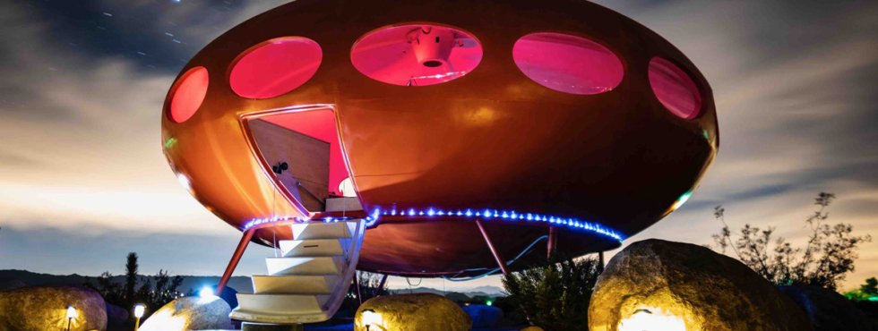
10 of the most unique Airbnb listings you’ll ever see (10 Photos) by: Adam Nov 26, 2022 1466 Liked! 172 Disliked 0 humanity
Blue Collar creative innovation is here to get the job done! (32 Photos) by: Bob Apr 11, 2024 04/11/24 2588 Liked! 9 Disliked 0 humanity
H*rny crochet projects proving everyone has their mind in the gutter by: Zach Apr 10, 2024 04/10/24 1735 Liked! 24 Disliked 0 humanity
Graffiti art nightmares brought to you by Barcelona’s own David Lozano (25 Photos) by: Zach Apr 6, 2024 04/06/24 2419 Liked! 17 Disliked 0 humanity
Woman creates inclusive dolls that kids can see themselves in (32 Photos) by: Camry Mar 28, 2024 03/28/24 1953 Liked! 16 Disliked 0 humanity
Construction jobs & botched designs so bad we wonder how people got the gig in the first place (35 Photos) by: Bob Mar 21, 2024 03/21/24 2588 Liked! 9 Disliked 0 humor
25 shower curtains that exude pure insanity by: Zach Mar 5, 2024 03/05/24 3936 Liked! 18 Disliked 0 humanity
Smart, but simple, designs that should be standard from now on (25 Photos) by: Stephen Mar 4, 2024 03/04/24 4206 Liked! 9 Disliked 0 humanity
Blue Collar creations that are borderline impressive (31 Photos) by: Bob Feb 27, 2024 02/27/24 3926 Liked! 12 Disliked 0 humor
Grab some bricks and just LEGO (25 Photos) by: Stephen Feb 24, 2024 02/24/24 2120 Liked! 9 Disliked 0 lifestyle
That age on the LEGO box is just a recommendation (25 Photos) by: Stephen Jan 24, 2024 01/24/24 1734 Liked! 7 Disliked 0 lifestyle
Cringeworthy car mods that would make Dom Toretto furious (25 Photos) by: Zach Jan 16, 2024 01/16/24 3327 Liked! 18 Disliked 0 auto
I hope Santa is leaving LEGO under my Christmas tree (28 Photos) by: Stephen Dec 19, 2023 12/19/23 1651 Liked! 7 Disliked 0 lifestyle
Inspirational tattoos that pack a heap of wholesomeness (20 Photos) by: Zach Dec 9, 2023 12/09/23 2940 Liked! 17 Disliked 0 lifestyle
Death By Toys ain’t your grandfather’s toy-maker (40 Photos) by: Zach Dec 6, 2023 12/06/23 1889 Liked! 26 Disliked 0 humor
Whoever built these abominations needs to hand in their toolbelt ASAP (37 Photos) by: Bob Nov 30, 2023 11/30/23 2669 Liked! 9 Disliked 0 humanity
Sometimes Less IS More (30 Photos) by: Jackson Nov 28, 2023 11/28/23 804 Liked! 8 Disliked 0 humanity
We’ve seen the future, and these things are certainly in it! (20 Photos) by: Bob Nov 21, 2023 11/21/23 966 Liked! 6 Disliked 0 humanity
Creative advertisements that’ll make you do a double-take (30 Photos) by: Camry Nov 14, 2023 11/14/23 706 Liked! 3 Disliked 0 entertainment
I’m beginning to think these images might be Photoshopped…(30 Photos) by: Bob Nov 9, 2023 11/09/23 737 Liked! 1 Disliked 0 humor
It is never too late to become a LEGO master (25 Photos) by: Stephen Nov 8, 2023 11/08/23 453 Liked! 5 Disliked 0 lifestyle
Spoonfuls of Nostalgia With This Vintage Kitchenware (35 Photos) by: Jackson Nov 2, 2023 11/02/23 752 Liked! 4 Disliked 0 humanity
Hilariously creative desktop wallpapers to spice up your work day (20 Photos) by: Camry Nov 1, 2023 11/01/23 671 Liked! 14 Disliked 0 entertainment
Redneck innovation is so crazy is just…might…work! (33 Photos) by: Bob Nov 1, 2023 11/01/23 1120 Liked! 18 Disliked 0 humor
Artists show their growth over time and it’s insanely impressive (30 Photos) by: Elizabeth Oct 25, 2023 10/25/23 836 Liked! 7 Disliked 0 lifestyle
Luxurious landscaping that will inspire your inner gardener (30 Photos) by: Adam Oct 21, 2023 10/21/23 732 Liked! 7 Disliked 0 humanity
Strange and beautiful things found in 100-year-old homes (30 Photos) by: Zach Oct 20, 2023 10/20/23 1090 Liked! 17 Disliked 0 lifestyle
‘Trash Tattoos’: Meet the artist who can’t draw but is continuously booked by: Zach Oct 19, 2023 10/19/23 382 Liked! 47 Disliked 0 humanity
Bad*ss Halloween decorations that nailed it like no others (32 Photos) by: Elizabeth Oct 19, 2023 10/19/23 582 Liked! 9 Disliked 0 lifestyle
x Looks like you already have a subscription! You can verify your subscription or upgrade to LIFETIME HERE: Upgrade
Looks like you already have a subscription! You can verify your subscription or upgrade to LIFETIME HERE: Upgrade